In Korea, people are 'ordering' food that never arrives. There's a product lesson in that.
Key takeaways
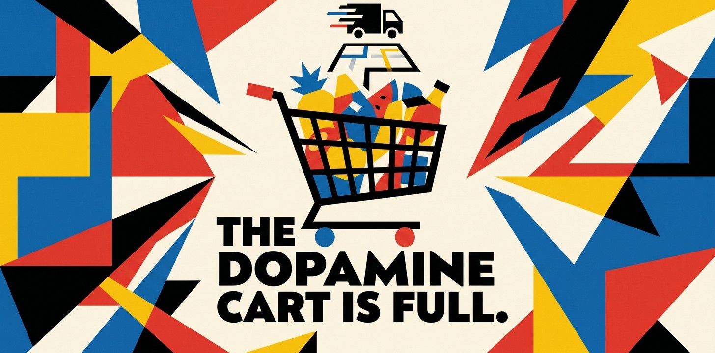
The funnel can be the product
For dopamine-site users, the browsing and the anticipation are the payoff, not the purchase. Worth asking which part of your product people actually show up for.
Engagement isn't always intent
A long session and a full cart can mean someone's enjoying the ritual, not signalling a buy. Read those numbers with that in mind before you forecast off them.
Friction at the decision moment is what breaks the spell
Korean users named delivery fees as the thing that makes them hesitate. On a real store, that moment is your checkout: shipping costs revealed late, a forced signup, a clunky payment step.
Ambient presence is cheap and surprisingly potent
The 'who's here right now' counter on the smoke-break site eases loneliness with almost no engineering. Used honestly, shared-presence cues beat fake-urgency tricks.
There's a website in South Korea where you can order food that never arrives. On purpose. You scroll the menu, read the reviews, check the star ratings and the estimated delivery time, drop a few dishes into your cart, and then nothing. The order button doesn't work, because it was never meant to. You were never going to eat anything. And that's exactly why people keep coming back.
The Korea Times reported in late May that these so-called "dopamine sites" are spreading fast among young Koreans. The South China Morning Post ran its own piece under a blunter headline: apps that do nothing. Quick stimulation, zero transaction.
Easy to file this under weird-internet and move on. I'd hold off. If you build software where people browse, choose, and check out, whether that's a store, a booking flow, or a food app, this pokes at an assumption most teams never bother to question.
What's actually on these sites
The food one is the clearest. It looks like any delivery app you've used: restaurant cards, photos, star ratings, even an estimated delivery time. You pick dishes, you add them to a cart, and after you "order" you get to watch a little courier icon make its way toward you on a map. The only thing missing is the part where money changes hands and food shows up. Everything else is intact.
Another one is built around the Korean slang for stepping out for a smoke. You hit a start button and see a live count of how many other people are "on a break" at the same moment. No cigarette involved. Just the feeling of stepping outside with other people, minus the people and the outside.
Kim Heon-sik, a professor at Jungwon University quoted in the Korea Times piece, tied it to burnout and a shaky sense of the future. His point was that people are finding comfort in feeling loosely connected, even to strangers. He compared it to mukbang, the eating-broadcast genre where you watch someone else have the meal: a way to experience something at one remove. Food, drink, a smoke break, all of it secondhand.
The users' own explanation is the part that stuck with me. On a real delivery app, the fee is what makes them stop and second-guess the order. Here there's no order to second-guess, so the hesitation never arrives and they just keep going. The moment that normally ends the session, paying, has been quietly deleted. So the pleasant part runs as long as they want it to.
The part most product teams have backwards
We tend to treat the funnel as overhead. The browsing, the comparing, the adding-to-cart: stuff users put up with on the way to the real event, which is the purchase. Dopamine sites turn that on its head. The browsing is the event. The transaction was just where it happened to stop.
This isn't brand new, if you think about it. Window shopping has always been a thing. Plenty of people keep wishlists they never buy from and treat "add to cart" as a mood rather than a commitment. What's clarifying is watching someone remove the purchase completely and report that the experience got better, not worse.
The detail I keep coming back to is the courier tracking. The part of food delivery that's pure dead time, staring at an icon crawl across a map while you wait, turns out to be worth simulating on its own. The waiting was never the cost of the meal. For some people it was part of the reward.
The uncomfortable read for e-commerce
If the satisfaction lives in the browsing, then a good chunk of the "engagement" on your store isn't buying intent at all. It's people enjoying the ritual. Long sessions, deep catalog scrolling, a cart with five things in it, and no order, because buying was never the plan for that visit. That's not a broken funnel. That's a different job the product is doing, whether you designed for it or not.
It also points straight at what kills the good feeling: friction at the moment of decision. The Korean users named the delivery fee. The fake site wins by removing that moment entirely. On a real store, that moment is your checkout, and it's usually where you've stacked your worst surprises: a shipping cost that only appears at the end, a "create an account to continue" wall, a payment step that asks for the same information twice.
The practical takeaway cuts two ways. Don't read every engaged session as a near-purchase, or you'll over-forecast and then wonder why the revenue didn't follow. But do treat the browse experience as a real product, because for a slice of your users it's the thing they came for, and those people still convert later, or tell a friend, or come back when the timing's right.
What's worth borrowing
A few things from all this are actually usable, and none of them require building a fake anything:
- Make the journey enjoyable on its own terms. Anticipation, progress, a sense of getting closer to something. A booking flow or a store that's pleasant to move through earns goodwill even on the visits that don't convert.
- Strip friction out of the real decision moment. Show shipping costs early. Let people check out as guests. Don't ask for the same detail twice. The dopamine site's whole trick is that the hesitation point never comes; your version of that is a checkout that doesn't ambush anyone.
- Use ambient presence honestly. The smoke-break site's "twelve people are on a break right now" is cheap to build and emotionally real. A live viewer count, a quiet "others are looking at this too," shared presence in a waiting room. The line to watch is honesty: the same mechanic powers fake-urgency dark patterns, and users can smell the difference.
- Measure the browse and the buy separately. "Enjoyed looking around" and "meant to purchase" are different states. If your dashboard blends them into one engagement number, you'll keep mistaking one for the other.
I don't think dopamine sites are a model to copy. They're more of a symptom: burnout, everything costing too much, young people self-soothing with simulations of things they can't quite afford or face. But they accidentally isolated something true. For a lot of products, the experience people actually want isn't the outcome. It's the run-up to it. It's worth knowing which one you're really selling, before you optimize the wrong half.
Frequently asked questions
What are 'dopamine sites'?
They're Korean websites and apps that simulate a satisfying ritual without the real action behind it. The best-known example is a fake food-delivery app: you browse the menu, read reviews, add things to a cart, even track a courier on a map, but there's no working order button. Korea Times reported the trend spreading among young people in May 2026.
Why would anyone use a shopping site they can't buy from?
Because taking the purchase out takes the pressure out, and the cost with it. Users told reporters that delivery fees make them hesitate on the real app; on a site where ordering is impossible, they can keep browsing with no stake. The anticipation is the whole experience.
What does a Korean internet trend have to do with building software?
If you build e-commerce, booking, or anything with a cart, it's a useful reminder that the browse experience has value on its own, that engagement doesn't equal buying intent, and that checkout is usually where the good feeling goes to die. Those are design decisions, not just metrics.
Isn't this just window shopping with extra steps?
Partly. But the simulated courier tracking and the live 'people here now' counters add anticipation and a sense of company that plain window shopping doesn't. That added layer is the part worth studying, because it's the part teams tend to leave out of real products.
Related posts
ChatGPT's app store is six months old. Should you build there yet?
900 million people use ChatGPT every week, and it now has an app SDK, a directory, and its first 300 apps. The distribution pitch is real. The traffic, so far, mostly isn't.
What it costs to rescue a vibe-coded app in 2026
Fixing AI-built apps is now its own service line, and the quotes run from a $3,000 audit to a half-million rebuild. Here are the real tiers, and the five signals that tell you which one you're in.